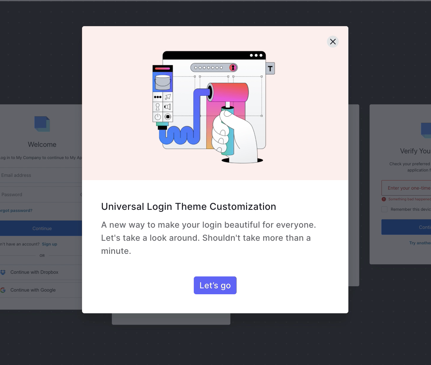
Overview
When I started at Auth0 as a Product Designer for the Login and MFA team, I was suddenly facing a big challenge. I was assigned to an ongoing project that was preparing to release the CSS code of the login experience, providing customers the freedom to customize their login screens. My role spanned both designing the dashboard and shaping the end user experience.
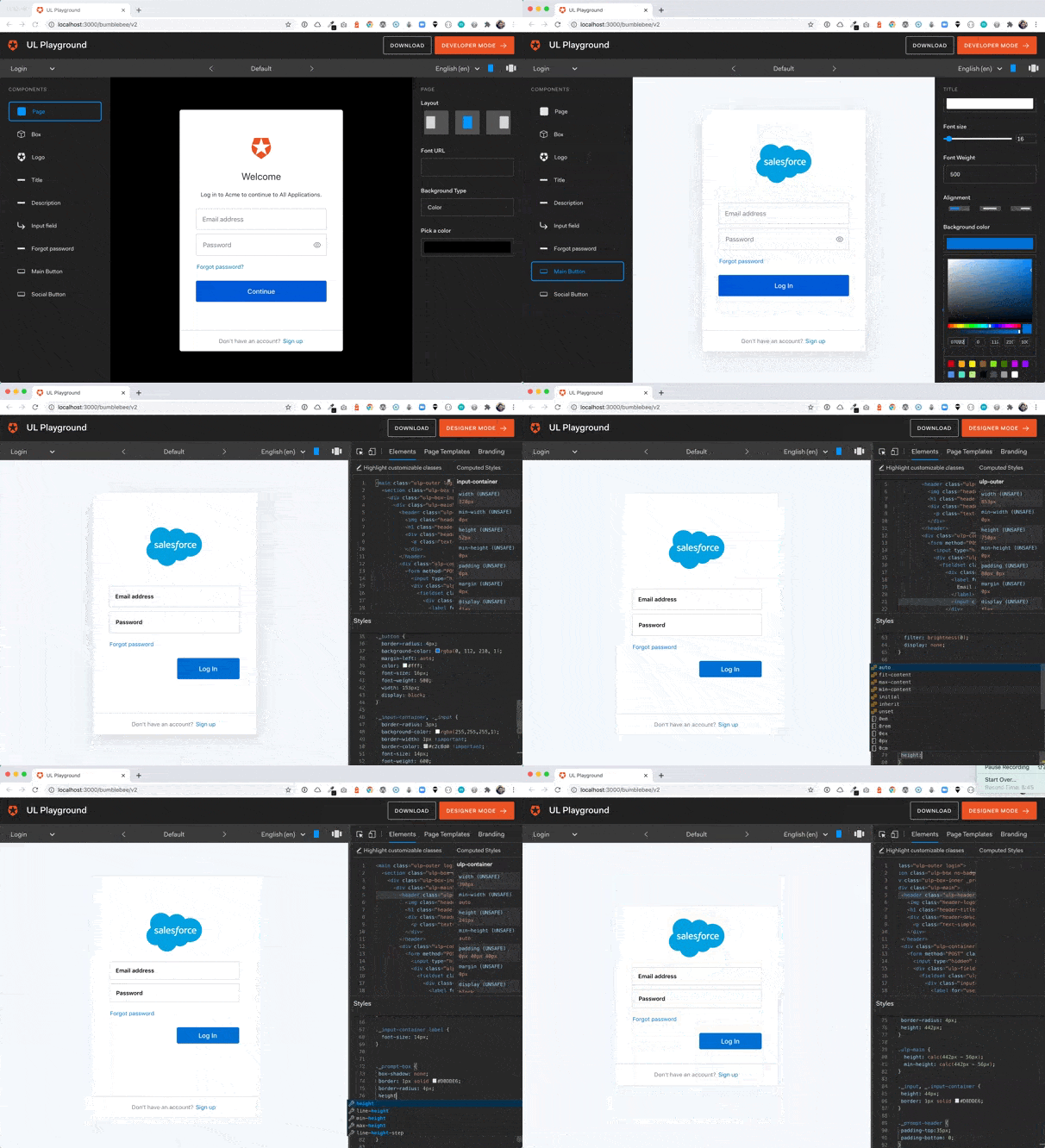
While testing the soon-to-be-released feature, I quickly realized the task was trickier than expected. The code wasn't mature enough to be made public, and it certainly wasn't designed for customization. With a little bit of elbow grease and a lot of ingenuity, a Front-End engineer and I decided to tackle the challenge head-on.
Challenge
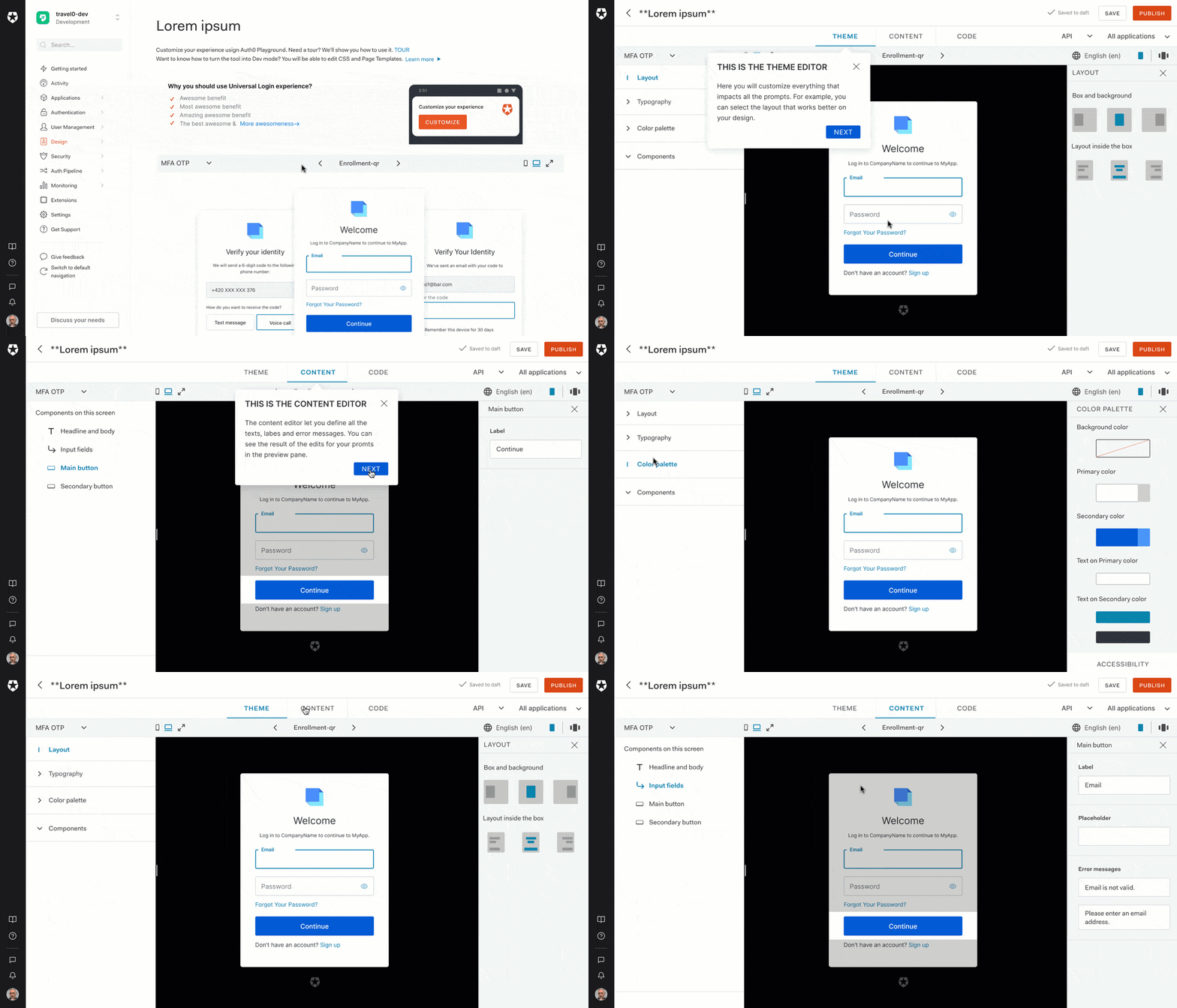
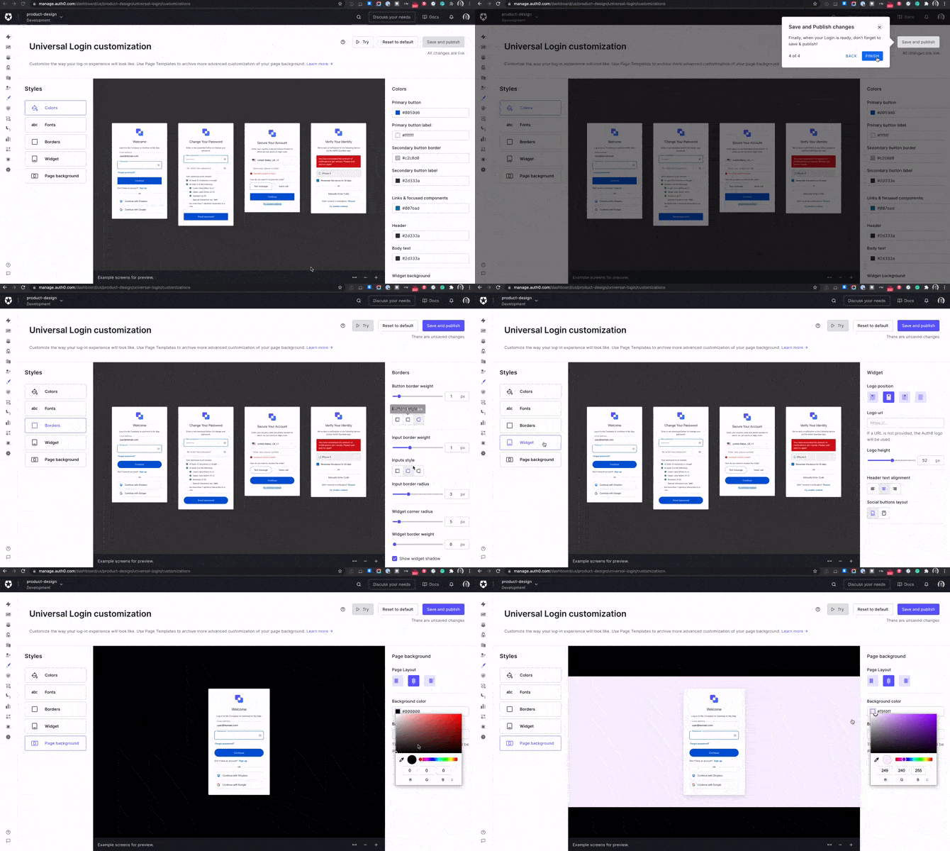
We ran a design sprint, testing our concepts and iterating our proof of concepts (PoCs) until we struck gold - a WYSIWYG tool that could customize the experience without a single line of code. This was our big eureka moment and the genesis of our no-code customization tool.
Why is thistool better than CSS customization? There are two main reasons:
- Developers don’t want to waste time learning how to customize with CSS.
- The person responsible for customization is not a developer.
- Additionally, this tool can give us some extra time to iterate the CSS code until it is ready to be released.
But, what’s the potential value for the user?
- No need for a purpose team or a developer role to customize the login.
- Easy and out-of-the-box solution for branding.
- No risks of code breaking or need for code updating.
Journey
>With our new proposal in hand, we got green light to develop an MVP for the dashboard. Realizing the enormity of the task ahead, we understood we needed to build a team. With the help of a technical manager, we developed an MVP document and made our case to upper management.
The next steps involved designing a roadmap, conducting interviews, and forming the Universal Login Experience team. Our main goal was to implement the no-code tool, but we didn't stop there. We wanted to expand the no-code approach to 'My Account', custom prompts, custom text, email customization, and all end-user features. Mainly because all these were out-of-the-box solutions which means easy to implement and integrate with any application. That’s why I also set up a no-code working group within the design team which aimed to keep these experiences consistent.
Once we developed our private beta, we invited customers to test the product, using their feedback to refine and add features. Although the process took longer than expected, the result was a tool that was valuable for customers who didn’t have a dedicated engineering team to customize the login experience.
My role in this process was to wear different hats. I took broad conceptual ideas and turned them into something useful and valuable for our customers. I drove clarity of plan, strategy, and vision among product managers, engineers, researchers, and content strategists. I played a part in high-level strategic decisions, working closely with Product, Research, and Engineering partners from concept to completion and future iterations.
I owned the end-to-end design across multiple features and projects, providing implementation guidance to engineers to ensure our features were of the highest quality. Furthermore, I used tools like Heap to stay on top of industry trends and measure usage metrics.
One key goal of ours was to position Auth0 as an innovative company in the Gartner Quadrant. This project was a significant step towards that goal, demonstrating our ability to create user-friendly solutions while staying on the cutting edge of technological advancements. Through this project, we've shown that we're a company that turns challenges into opportunities, creating products that provide genuine value to our customers.
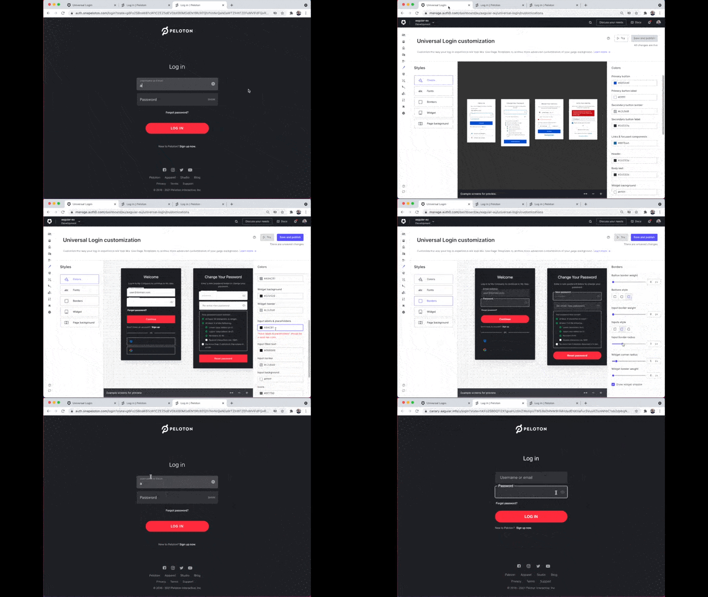
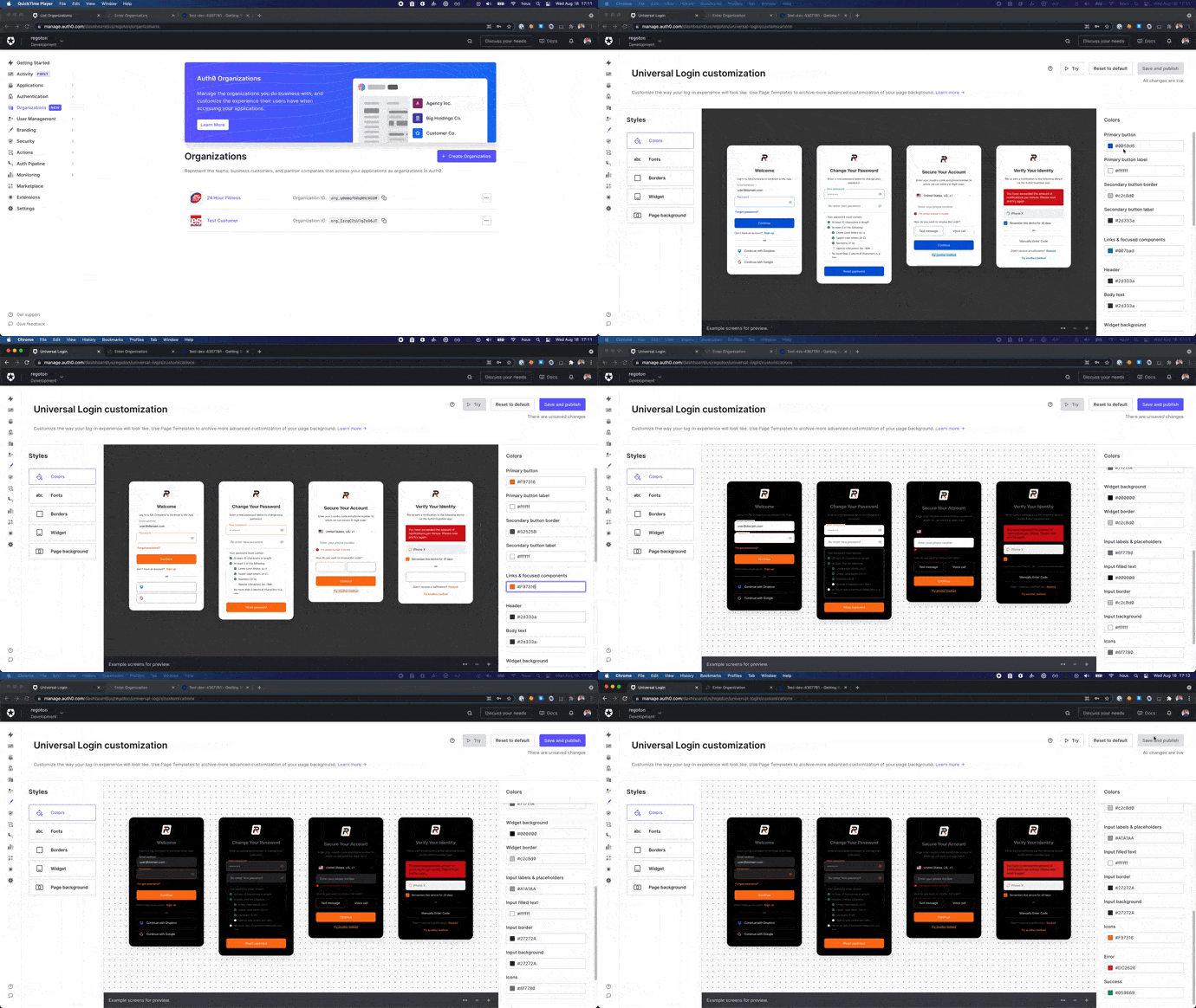
This entire no-code journey has been as much about learning as it was about designing. Here's a snapshot of some key takeaways from my experience:
- User-Centric Design: One of the most critical lessons was the importance of putting the user at the center of the design process. From the dashboard to the login experience, every decision had to consider the end user's needs and abilities. This approach helped us create a tool that resonated with our customers and met their needs effectively.
- Collaboration and Communication: Working closely with amazing engineers, product managers, and other stakeholders taught me the value of collaboration and clear communication. We all brought different perspectives and expertise to the table, and this diversity was our strength. It helped us to address challenges creatively and arrive at solutions that were comprehensive and well-rounded.
- Iterative Design and Testing: Through this project, I learned that design is an iterative process. We didn't just launch a product; we tested, learned, and improved. This approach helped us enhance our tool continually, ensuring it stayed relevant and valuable to our customers.
- Strategic Decision-Making: Being involved in high-level strategic decisions honed my ability to think beyond the immediate design task. I learned to consider broader business objectives, industry trends, and competitive landscape in our decision-making process.
- Technology and Trends: With the rapid pace of technological advancements, staying updated is crucial. The use of tools like Heap for collecting usage metrics was a great learning experience. It not only helped us make informed decisions but also enriched my understanding of user behaviors and preferences.
- Leadership: Lastly, forming and leading the no-code working group within the design team was an excellent opportunity to develop my leadership skills. It helped me foster a culture of innovation and user-centric design within the team.
Through all of these experiences, I've come to understand that product design is a blend of creativity, strategy, technology, and most importantly, empathy for the end user. It's a continuous learning journey, and I look forward to many more lessons in the future.
Recommended article for further exploration: The way we customize
Play to Move: Empowering Kids with a wearable device
Transforming playtime into fitness fun: the story of Miss Baker Prototype
Go to case →Developing a VR Login Experience
Seamless Entry to VR experimentation: Crafting an Oculus Quest 2 Login Experience with Unity 3D
Go to case →